

This is most likely just one of the many questions you have about the usage of your Qlik environment. You want to be sure that you allocate the right license types to the right kind of user, but how do you know that? Which are the apps that are used the most and which are not used at all? And when can you expect the highest load on your system because of ‘Qlik rush hour’?
But … doesn’t the Governance dashboard provide me with this information?
Well, currently, there are two good applications that give you this information: Governance Dashboard and Systems Monitor. Now even though Agilos have been using both of these for a long time, we have come to the realization that they show either too much information or not enough is relevant when we want to focus only on understanding what users are doing.
Perhaps then too much usage information is better than none, right?
That’s right. But what we see in practice is that the Governance Dashboard provides you with so much information that it’s just too complex for the majority of users, which led us to conclude that there was a need for a simpler application that focuses on core KPIs. It’s why we developed the Usage Statistics Dashboard. It is a QlikView Dashboard focused precisely on what the QlikView users actually do and use. The objective here therefore is to quickly understand how your QlikView applications are being used by everyone.
Does it mean that users can ignore their Governance Dashboard?
Well, not really. In fact, we still have it in our QlikView server but we realized that it is better to use it as a complementary source of information, for instance when we want to have more details not analyzed in the Usage Statistics Dashboard.
Which information is relevant?
Good question. What we’ve realized after numerous Qlik implementations is that everyone always asks the same questions. Are users using our QlikView Applications? Which apps, which app’s objects, sheets, searches are used the most? Did we allocate the right licenses to the users? When do users connect the most: during the morning or the afternoon or some other time? When is the best time to stop the QlikView service for maintenance purposes without impacting our users?
The dashboard’s aim is clear, but now comes the crazy part. We wanted to be able to see all this information in just one place. We wanted to avoid navigating through more than one page and losing focus on what we were analyzing as so often happens on the Governance Dashboard, for instance.
A glimpse at the Usage Statistics Dashboard
To understand how to make this happen, let’s have a look at the Usage Statistics Dashboard.
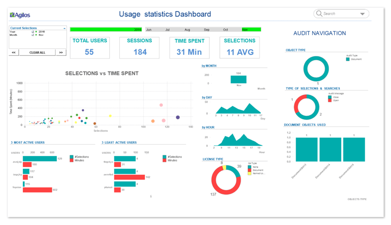
 The application is divided in two main parts: on the left side, you have all the information related to the user sessions; on the right side you have the navigation information (Audit information).
We consider that the most important thing is to understand whether the users are active or not using our QlikView applications. For that reason, we’ve created a scatter plot graph at the heart of the application, because we want to know user activity. User activity is a clear indicator about how our applications are of interest to them, as well as the time spent per user. Because the more time they spend the more interested users are in our applications. These two factors combined give a good indication of QlikView apps usage. Therefore, when we want to analyze any of our initial questions we can see the number of dots (users) we have and how they are distributed over the graph. It is interesting to see how the dots can be grouped by their activity behavior and it is also easy to identify some clear patterns on user types (maybe this is the first human machine learning we can get).
But, we should not forget that we also need KPIs ... At the top of the dashboard you will find the KPIs related to the total number of users, sessions, average time and selections performed. Thus, every time we select a particular object type, like the scatter plot chart that we already commented above, the KPIs are populated with the relevant figures.
Drilling down on specific user behavior – about Named User and Document Cals
Another important topic is how we can get further information and drill down on user’s behavior. As an example, let’s follow a typical scenario. We want to select a group of users and analyze relevant usage information as it relates to them. Let’s return to the scatter plot graph and select those dots (users) that are top right. These represent users that we typically want to have as QlikView consumers, because those users are very active and spend a relatively long time using our applications …

Now that we’ve selected these ‘heavy’ users, let’s see what other information we can find about them in the dashboard: the time spent, the number of sessions, the amount of selections they perform, which months they connect, which days during the month and the times they connect most. The type of licenses they have and who is the most and least active.
Now, we can perform a different analysis. Let’s select only one license type, e.g. Named Cal users. In this way we can get the same kind of information but segmented by license type. We can see that Named Cal users connect mainly after lunchtime until 4pm, and see that they spend less time than those users having a document cal license. We could also analyze those that have low activity connections to our apps and detect users with a  Named Cal license. Do the Named Cal license users connect to more than one application? We also can compare and find patterns easily.
This means that the Usage dashboard can also be used to optimize license usage. If you detect named cals that are not really used, you can reassign licenses and save money!
Want to engage your users? Have a look inside the usage report!
We will also need to know what the user’s preferences are as it relates to the QlikView reports. We talk about the navigation Information (Audit Information). In fact, this is one of the most important assets of the Usage Statistics dashboard because it combines all users’ sessions with all the audit information from any QlikView report. This feature is useful if you want to improve the user’s experience. It starts from as simple a thing as knowing which object types/ selections/searches and  document objects are used most or least. Knowing about the objects usage helps you understand how you can improve the QlikView reports or even confirm that the investment made to produce your new and fancy dashboard was worthy.
If you see that a certain sheet is never visited, you can -as a follow-up action- ask the user for the reason behind and maybe remove it or modify it to make the application more efficient and keep only the relevant information. The same goes with objects.
We hope our example helped you appreciate that lots of questions can be answered at the same time … however we also hope you can share with us your opinion about this subject too.
Here’s what we suggest
This Usage Dashboard gives you a better high-level view to monitor the usage of Qlik in your company, and complements the Governance Dashboard. We hope that the scenario we’ve used gives you a good idea about the capabilities and ease of use of this dashboard and are looking forward to your feedback. If you want to know more, don’t hesitate to contact us.

This article has been written in collaboration with Oscar Garcia Bofill.