Internet is an incredible source for miscellaneous data, although it’s sometimes difficult to separate the useful information from the useless one. This free information provided on the web can add value to your data, but the risk of misinterpretation is higher too. In this article we will show an example of how the data provided by Google Maps could help you optimize your road trips.
Last month, a colleague of mine asked me when it would be the best time to come over to Luxembourg. He told me that in Brussels, the worst days for car drivers are Tuesdays and Thursdays. But what about Luxembourg?
I answered him to ask Google… because Google knows everything!
And that’s what he did. As you probably know, you have the possibility to change the departure time when you use Google Maps:
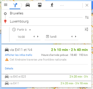
Google gives you a range of driving time based on historical data.
In this example, driving from Brussels to Luxembourg on a Monday at 4PM will take you between 130 minutes and 160 minutes.
What you probably don’t know is that this information is available in the source code of the web page:
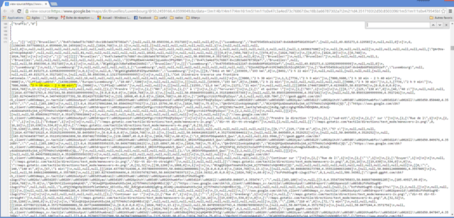
Yes, it’s here, on line 171:

Because I started to use Alteryx a few months ago, my colleague asked me to create a workflow that will ask google for an entire week, looping the request on the departure time.
I started to understand how the parameters were sent to the service: at the end of the URL, I saw something that looks like a time stamp:

I was then ready to build a workflow in Alteryx. First, I started to create a macro that will take the URL as input and that will give 4 fields in output:
- The theoretical driving time: based on distance and speed limitations of roads. This duration is independent from the departure time.
- The normal, minimum and maximum driving time (based on historical data)
Here’s an output example:

Then I built another workflow connected to this macro to repeat the execution for each departure time.
This simple workflow looks like this in Alteryx:

And the output is a simple spreadsheet:
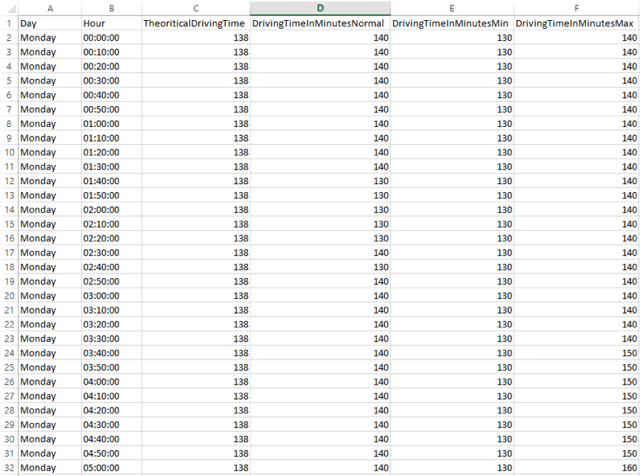
The last step is then to load this spreadsheet in Qlik Sense to visualize the results. This is the overview of the application:
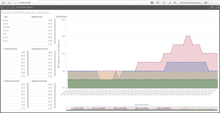
The customer is available every day at 9:30. Which day my colleague should choose?
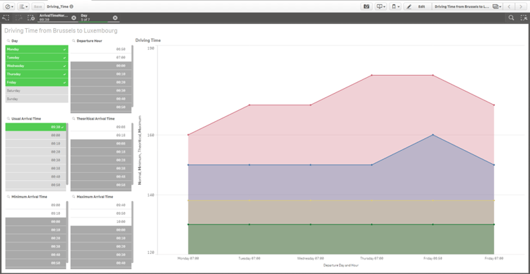
As you can see, the red area (maximum driving time) is less in Monday than it is at the end of the week, so my colleague will choose a meeting on Monday.
With the Qlik associative model, he can directly find the related data to this trip by selecting the chosen day:
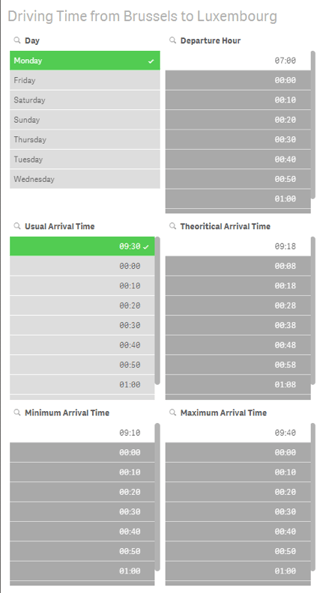
He knows that he will probably arrive in Luxembourg between 9:10 and 9:40 if he leaves at 7:00.
What is very powerful with Alteryx is the ease of reusability of workflows you already built. The work has already been done for one track, you just have to transform this workflow into a macro and execute the macro for every single track.
Qlik Sense is a great environment for visualizing and analyzing data. Alteryx can enrich your (internal) data with external data and make your analysis so much more powerful. At least my friend is saving a lot of time on the road, and doesn’t have to spend time analyzing it over and over again. That’s the joy of the automated workflows. Cool, isn’t it?
Wondering about the business value of this in a concrete customer case? Check out my post in the Agilos Business Blog here.
“Without data, you’re just another person with an opinion”
(William Edwards Deming)


